With Lighthouse product owners, designers, engineers, and managers can test and ensure web accessibility of their products.
There are a number of tools available for automated testing of web products. Here, I will demonstrate how we can use Lighthouse, a Chrome tool to scan your web product for common accessibility issues. By analyzing the product’s HTML, CSS, and JavaScript, Lighthouse identifies potential problems such as missing alternative text for images, improper heading structure, or keyboard navigation issues.
Let’s explore the simple steps of utilizing this tool to identify accessibility problems.
Accessing Lighthouse in your products
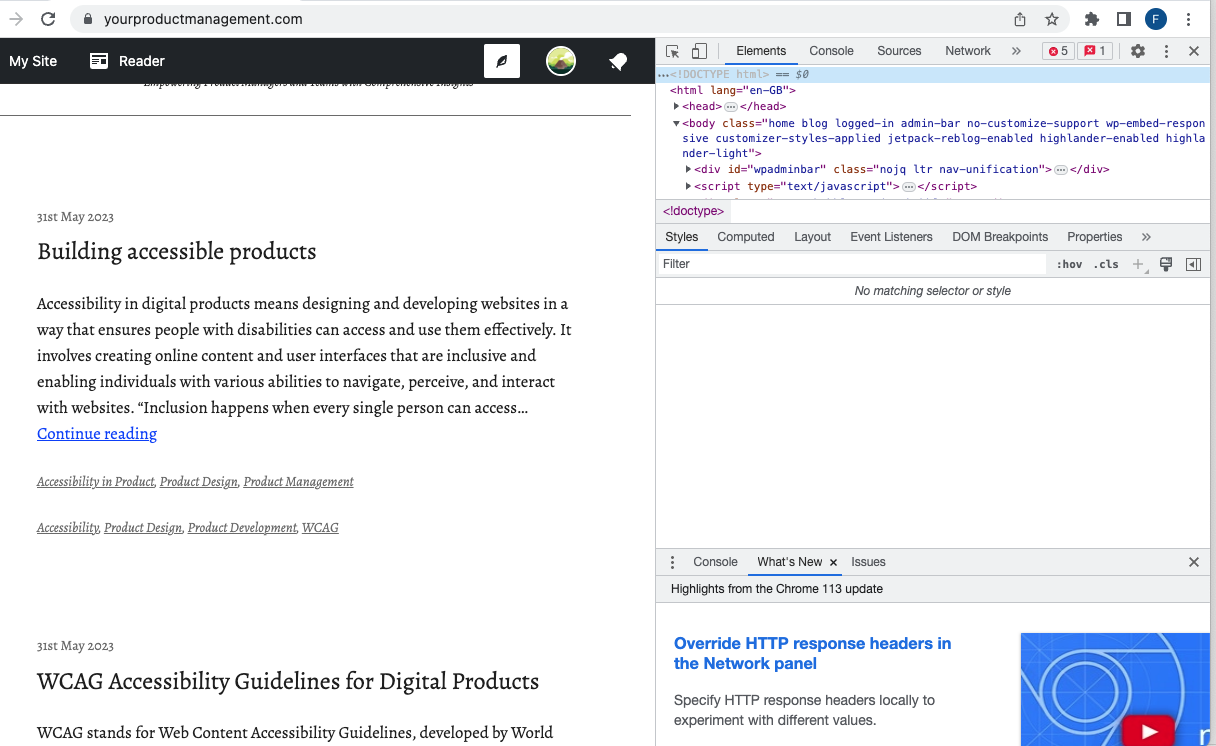
Right-click on your web page in chrome and select “Inspect”. This will open up a side panel on the right-hand side of the page.
Within the side panel, click on the double arrow (>>) to reveal additional options. Locate and click on “Lighthouse.”

Performing accessibility audit of your products
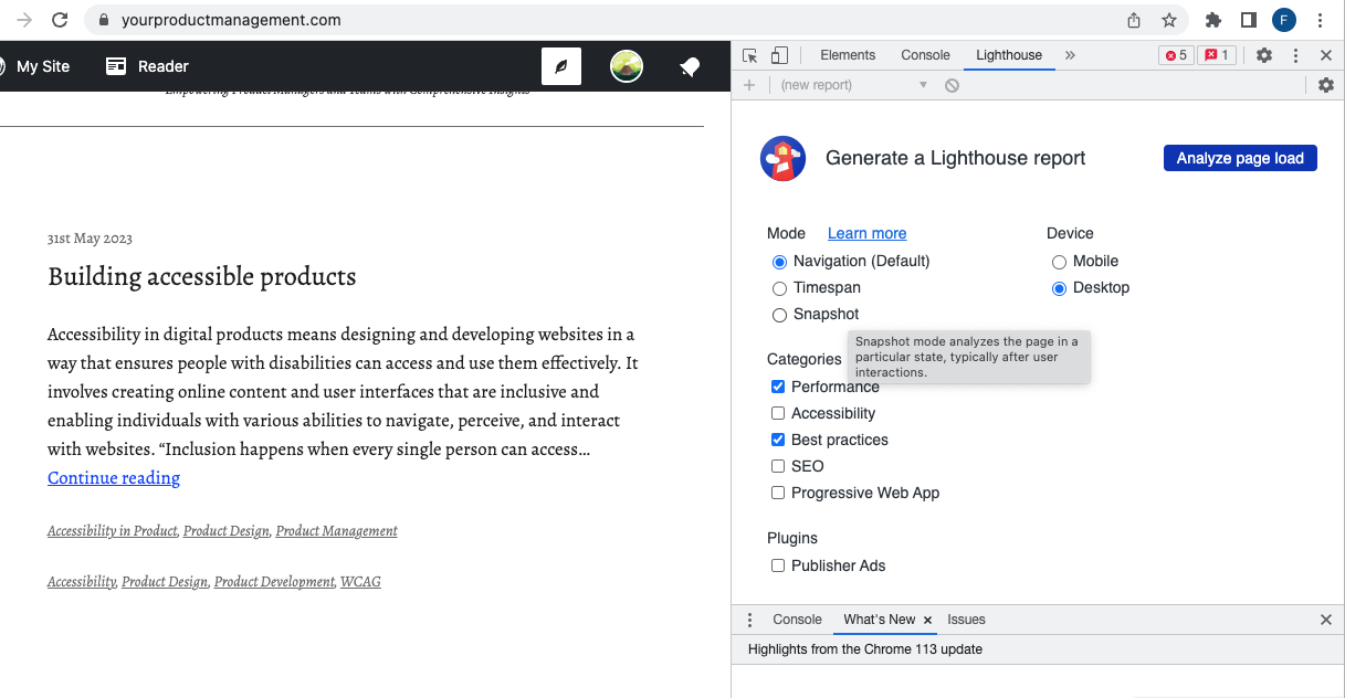
Once inside Lighthouse, click on “Analyze page load” and select the desired accessibility audit options. This action triggers the tool to run an accessibility audit of the web page and generate a detailed report.

If you wish to audit the web page for mobile accessibility, select the “Mobile” option. This feature resizes the viewport to emulate a mobile device.
How to read Lighthouse accessibility report
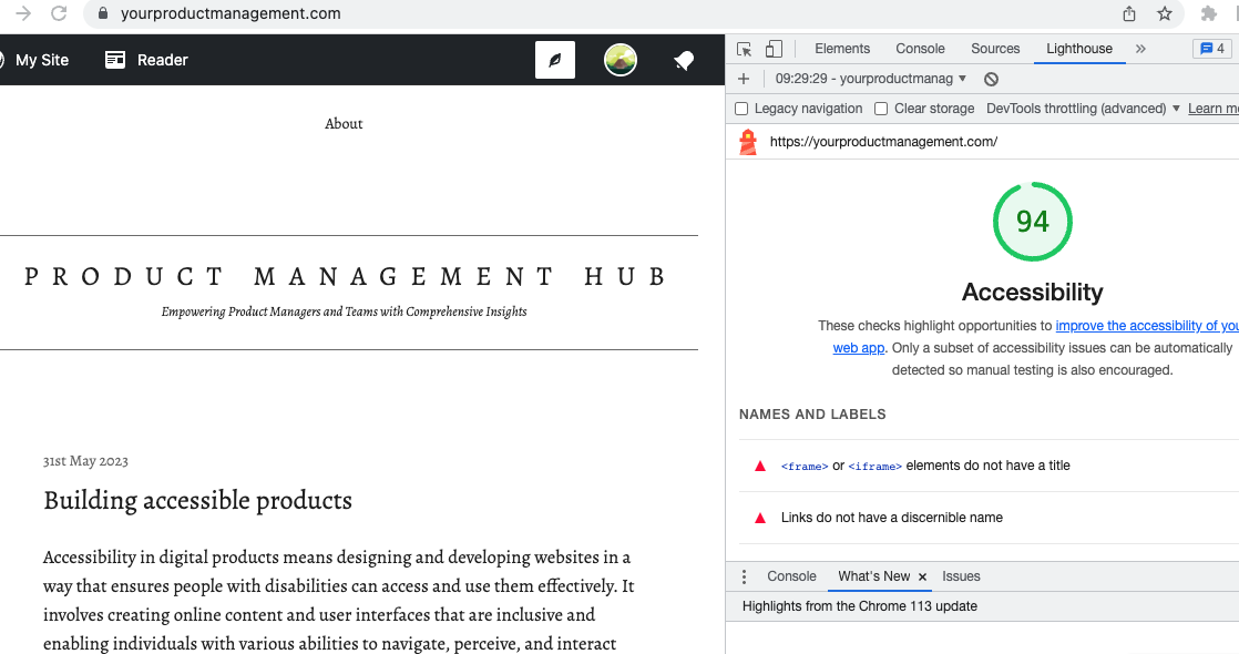
In the generated report, you can select any item to obtain further insights and information. This allows you to understand the specific accessibility issues identified by Lighthouse.

Key areas audited for Accessibility by Lighthouse
During the accessibility check conducted by Lighthouse, several crucial areas are examined.
Some of these areas include:
- Names for buttons
- Ensuring buttons have accessible names is essential for users who rely on screen readers. Lighthouse identifies buttons without accessible names, as screen readers announce them simply as “button,” rendering them unusable.
- Alternative text attributes
- Informative elements, such as images, should possess concise and descriptive alternate text. Decorative elements, on the other hand, can utilize an empty alt attribute, as they hold no significant information.
- Labels for forms
- Lighthouse verifies that form controls are associated with proper labels. This ensures that assistive technologies, like screen readers, announce them accurately, enhancing usability.
- Naming of links
- The tool evaluates link text and alternate text for images used as links. Lighthouse emphasises the importance of clear, unique, and focusable link text to enhance the navigation experience for users relying on screen readers.
- Aria labels
- When an element lacks an accessible name, screen readers announce it using a generic term, rendering it unusable. Lighthouse identifies such elements and emphasizes the need for appropriate Aria labels.
- Color contrast
- Low-contrast text poses difficulties for many users, making it challenging or impossible to read. Lighthouse flags instances of low contrast, ensuring optimal readability for all users.
- Navigation issue
- Properly ordered headings that do not skip levels convey the semantic structure of the page, making it easier to navigate and understand when using assistive technologies.
- All focusable elements must have a unique
idto ensure that they’re visible to assistive technologies.
By following the steps outlined above, you can leverage this tool to streamline the accessibility testing process, catching potential problems early on during development. By addressing these issues, we can create web products that are inclusive, providing a seamless experience for all users, regardless of their abilities.
